injuria
burgers TO SIN BY
1. The Brand & Concept
Injuria Burgers is Tijuana’s bold take on burger culture—bringing unapologetic flavor, inventive toppings, and a strong visual attitude to every bite. Focused on handcrafted burgers made to impress, Injuria stands out with its uncompromising commitment to quality meat, thoughtful ingredients, and memorable dining moments. The design identity leans into that raw, delicious energy—letting patrons taste with their eyes first.
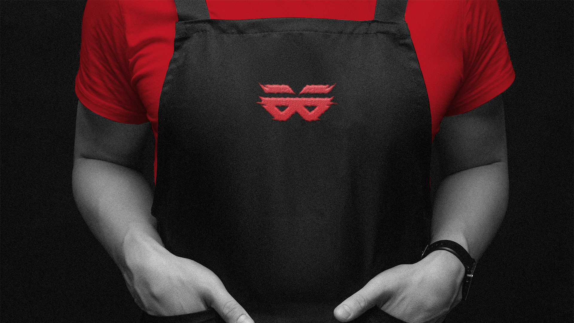
2. Logo & Visual Identity
The Injuria logo reflects a combination of grit and appetite. Typography is strong and slightly rugged, with personality that mirrors the boldness of its menu. Visual cues—textures, contrast, and urban influences—emphasize the burger shop’s character: not delicate, but confident. Every design detail was made to match the digestible intensity of biting into a stacked burger.
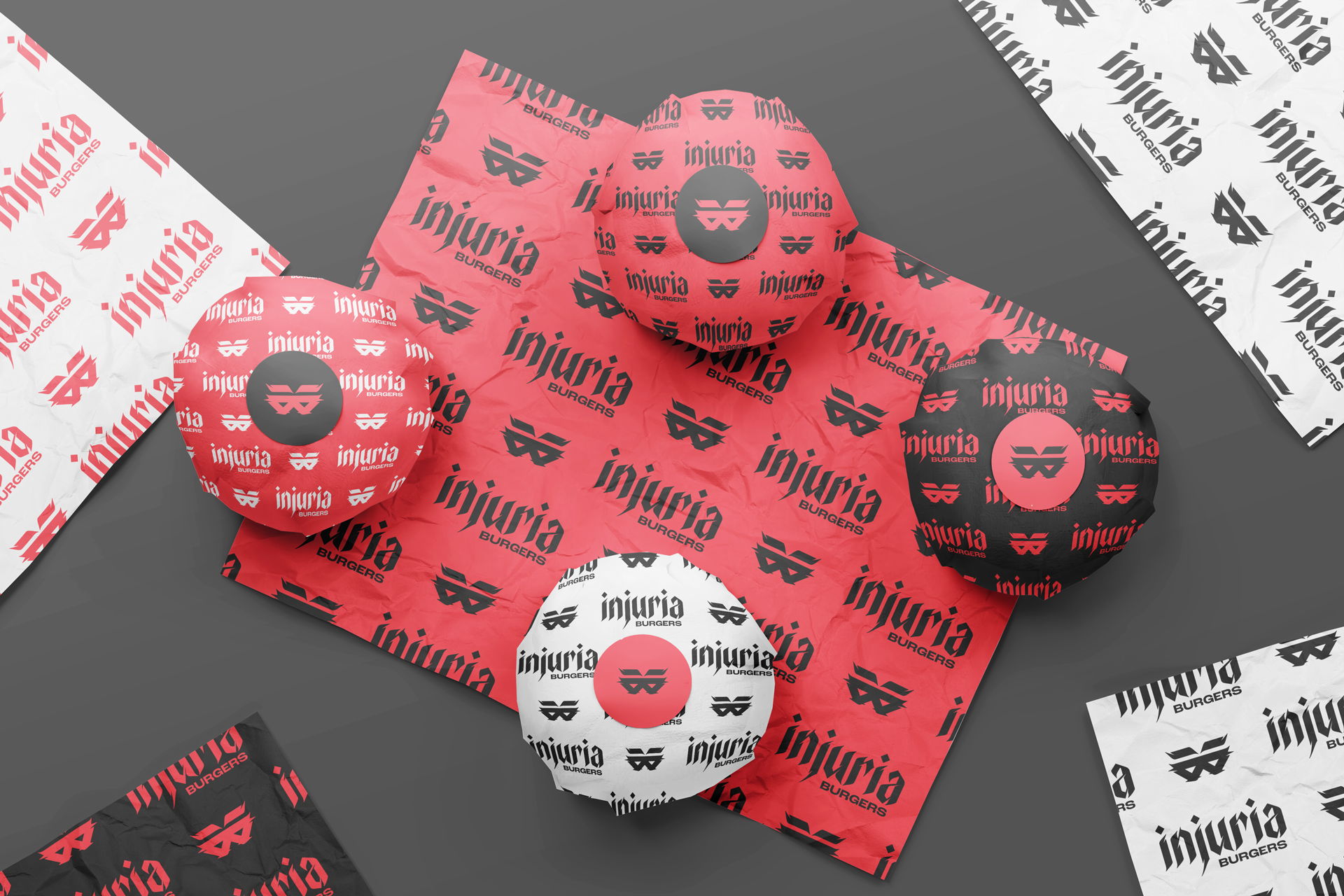
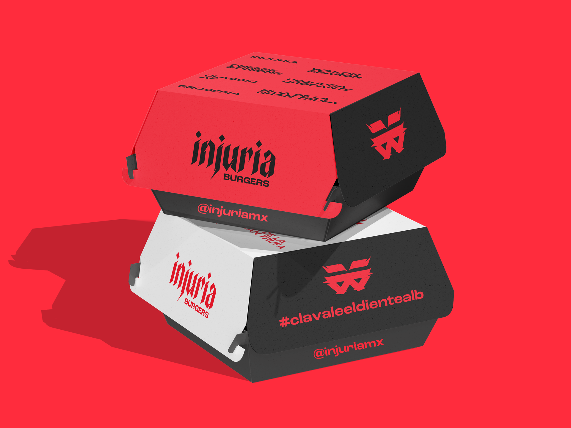
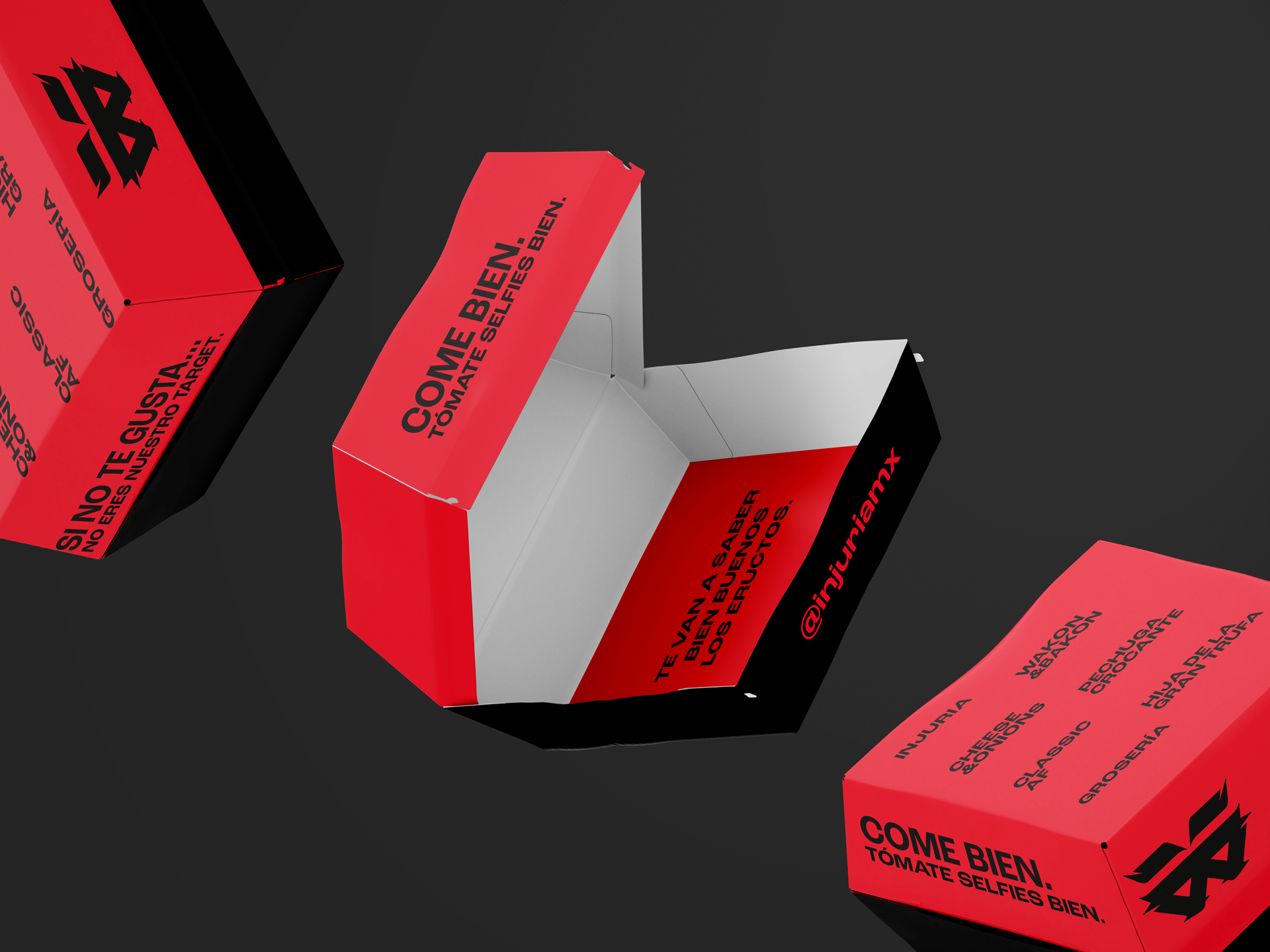
3. Graphic System & Brand Experience
Injuria’s graphic system builds around high-contrast elements: deep, dark tones offset by vibrant accent colors (e.g. tomato reds, mustard yellows, pickled greens) to make visuals pop. Texture and illustrative flourishes evoke grill marks, char, drips, and the tactile “juicy” side of burgers. Packaging, signage, menus, digital content—all carry the same visual voice that says “this is going to hit.”
4. Bringing the Flavor to Life
It’s not just about the burger—it’s about the mood. From everyday cravings to late-night indulgences, Injuria Burgers promises a full sensory experience. The brand identity aligns with the food’s boldness: strong visuals, energetic layouts, and memorable moments, so each visit feels like more than just a meal. With each new post, each dine-in plate, and each wrapped package, Injuria leaves a mark—something you eat, something you remember.